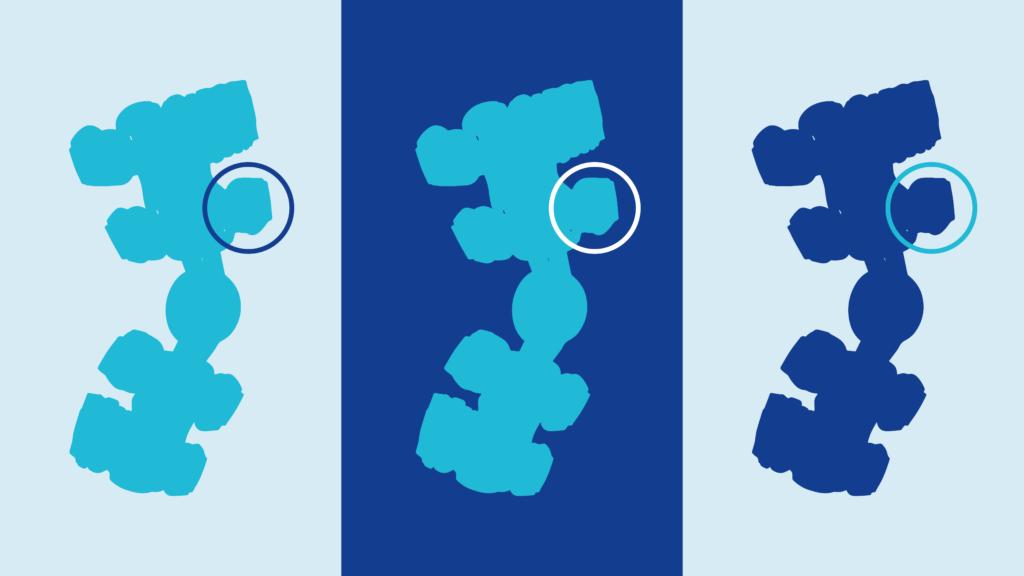
Variant 1
Variant 1 is a simple circle. This option is recommended, for example, if just one characteristic of an object needs to be emphasized. BF BLUE, white and BF CYAN should be used here (and in this order of priority).
Variant 2
If further distinctions are required between different areas of an image, the second variant is recommended.

The stroke width of the contour is derived from the stroke width of the font, in this case DIN Next Rounded.

BF BLUE should generally be used here. In cases where this is not feasible because of the color of the image, either BF CYAN or white can be used.

If the specific graphic is so small that “1” must be written instead of “01” for reasons of legibility, the element can be structured as follows.

Variant 3
The descriptions of the highlighted areas can be either be elsewhere (for example in a separate text) or right next to the diagram.

If the lines cannot be straight for spacial reasons, then they can be bent using the following angles.